Redesigning My Portfolio as a Field Journal
The problem
My earlier portfolio listed projects with screenshots and stack tags, but nothing explained why I built them or what I took away. I wanted the site itself to show taste - typography, spacing, photography - and give each project room for a real story instead of a card blurb.
Background
A static site is just HTML, CSS, and JavaScript files served as-is. There is no server rendering pages on each visit, which keeps hosting simple and load times predictable. For a personal portfolio that updates occasionally, that tradeoff made sense: GitHub Pages can serve the files for free, and a custom domain points visitors at the same bundle every time.
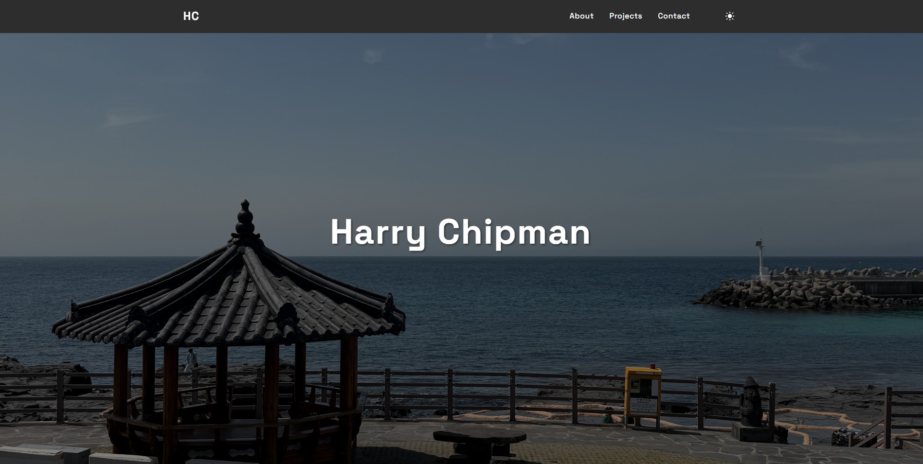
Layout-wise, most developer portfolios use a card grid - optimized for scanning many projects quickly. I moved toward a field journal layout instead: numbered sections, hero photography, and long-form entries that read top to bottom like a notebook. Cards answer "what exists?"; a journal layout answers "what happened and why does it matter?"
Something I did not appreciate until I read up on it: GitHub Pages started as a way to host project documentation straight from a repo branch. Adding a CNAME file turned that same mechanism into a credible personal site host - no VPS, no database, just git push and wait for the workflow. That lowered the bar enough that I could focus on writing and design instead of infrastructure.
Design direction
The homepage uses hero photography, numbered sections (about, projects, contact), and wide project entries with multiple screenshots where I have them. Dark mode is the default with a theme toggle stored in local storage. Figtree handles UI text; Spectral handles headlines.
Project highlights live on the homepage. This blog hub holds the longer write-ups so someone can skim the journal or open a full post when they want the how and why.
Technical stack
- Static HTML, CSS, vanilla JS. No build step - easy to reason about and deploy.
- GitHub Actions. Publishes to GitHub Pages on push to main.
What I learned
Design constraints sharpen decisions. Without a framework generating components, every repeated nav bar or footer is copy-paste I own - which hurt once the blog grew, but it kept the stack honest.
Splitting "highlight" (homepage) from "depth" (blog posts) stopped me from cramming essays into project cards. The homepage stays scannable; the hub carries the technical detail.
What I'd improve next
Lightweight RSS for blog posts, Open Graph images per article, and maybe a static site generator once duplicating nav markup across a dozen posts feels worse than learning Eleventy or similar.